Website Design

Tools:
| Pen + Paper | Qualtrics | Zoom | Miro | POP! Marvel | Adobe Illustrator | Figma | Adobe XD | Sketch |
The Purrfect Match
The Cute puppies Design Sprint project aims to improve the pet adoption experience for city residents. City residents often have a hard time finding the perfect pet that they can properly care for. While many adoption websites are great at displaying countless adoptable pets, they are not the best at giving potential adopters the information they need to make an informed decision that will benefit the pet and align with their lifestyles.
My Role
As a UX/UI designer, I conducted primary research with potential pet owners and analyzing modern match making apps and pet adoption sites to determine key problems and analyze the user’s needs. I also ideated data-driven solutions with research synthesis methods to determine key solutions that will improve the users’ experience and built interactive prototypes with Figma for usability testing and evaluate how well the problems have been solved and what can be improved in further iterations.
Time Frame: 1 week
Understand/Map
Highlights from the data
“I end up falling in love with a little dog that needs more space to live and play than I can offer”
Understanding the problem
The major problems that users mentioned during interviews and a usability include:
- Inadequate information: Other than breed and size of the pet, the most important information for adopters is the pet’s personality and temperament.
- Communication: Adopters have to contact representatives from adoption centers and shelters which is time consuming and difficult to keep up with
- Confidence: With the lack of information available, people cannot make a decision with total confidence that the pet would be a great fit for them.
Solution
Cutie puppies designed to help potential adopters feel more confident in their decision by matching potential adopters with the perfect furry friend who checks all the boxes. To solve the communication problem, my solution for Cutie puppies also provides a platform for users to communicate with shelters, inquire about the pets they are interested in adopting, and keep track of their communication.
User Journey Mapping
Using the insights, I was able to ideate the potential solution by iterating 3 different user journeys that map out the steps that users need to take to complete the adoption process. The 2nd map helped me to finalize the minimum viable product (MVP) for the prototype: onboarding quiz, browsing the matches, and keeping track of potential pets.

Sketch
Lightning Demos
Before I started sketching out the MVP, I set out to find inspirations by analyzing some of the most popular websites that were created to solve a similar problem including Adopt a Pet, Pet Finder, and Hinge. The analysis helped me discover the heuristics of similar platforms and what features are most effective to help users find their match.

Adopt a pet.
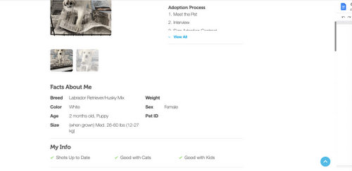
I found that the non-profit website focuses more on sharing images and showing the adoption process on the pet profile as both of this information are above the scroll. Below the scroll, the users can see the basic facts, information regarding vaccination status and compatibility with other pets and children, and more detailed description of the pet personality.
This website can be immensely improved by reprioritizing the information available. It may be more helpful for users to see the basic facts above the scroll right by the pictures to make best use of the screen real estate. As the adoption process is similar for most pets, it can be moved lower on the page where users can scroll down to see when they are ready to take the next steps.
Petfinder
Pet Finder does a really great job at providing a clean user interface to help users easily navigate. This website offers a quiz that is used to gather information about the potential owner. The quiz was short and easy to fill out. The questions on the quiz are personal enough to help users filter through pets that would match the user’s profile.
However, I believe the quiz can be improved to be more engaging and more personalized by asking the users what their ideal pets look like.In terms of the user interface design, the website feels more cohesive and has a great information architecture where users can easily scan the page to find information needed.
Crazy 8’s
After realizing the improvements, I could make on the popular comparable websites, I used the Crazy 8’s method to quickly iterate the different layouts for the quiz that would be most effective for the users and visualize the user journey on Cutie puppies.
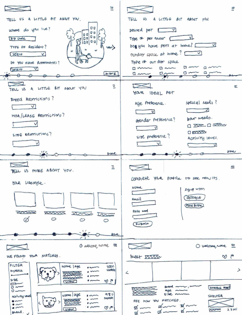
From the crazy 8’s, I picked out 3 critical screens for the MVPs that I defined earlier to sketch out in more detail. As the quiz I designed is longer than other websites, I decided to include a progress bar to guide users through the process. For the search results page, I included more information about each pet instead of just using photos to help users compare while they are browsing. Lastly, the pet profile page is designed to show the most important information above the scroll including photos, shelter information, description, fun facts, and a call to action.

Decide
Storyboard
As I’ve clearly defined the must have features for each MVP in the sketches of the CityPups’ critical screens, I set out to sketch the storyboard for the full user flows: onboarding, browsing, and managing matches.

Onboarding
- The homepage lays out how the website works and offers users 2 options: taking the quiz or going straight to browsing pets.
- If the user chooses to take the quiz, they have to answer questions about the user’s living situation, lifestyle, and preferred pet traits.
- At the end of the quiz, the user can either save their profile by creating an account, or just continue as a guest.

Browsing
- On the search result page, users will see all the pets that match the user’s profile
- Users can browse the list and click on each pet to learn more.
- While the users are browsing, they can save the pet to their favorites, send a message, and share their profile with the adoption center.

Managing matches
- Users can easily keep track of their contacts with adoption centers on the Messages Page
- Users can see their favorite matches that they saved and view the status of their communication with the adoption center on the Saved Matches Pages.
- Figma Prototype
- Using Figma, I turned the storyboard into a high-fidelity prototype. In terms of the visual design, I chose the high contrast color combination and clearly defined typographic hierarchy so users can easily scan for information. On the other hand, I used colorful illustrations and images to provide a pop of color to the design and highlight the photographs of the pets.
Quiz
The four page quiz is equipped with the progress bar with a percentage marker to show the user how far along they are on the quiz.


Sign Up / Log In
The simple Sign-Up page offers the option for users to continue their search as a guest before they commit to creating an account on Cutie Puppies


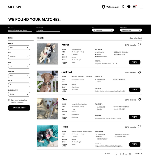
Search Results
The search results page shows the basic information about each pet including their features, vaccination status, how they behave with other pets or children, and if they have been house trained. On the pet profile page, users can read more about the pet’s personality, browse articles about the breed from reputable third-party sources, and directly contact the shelter.
Messages
On the messages page, users can chat with the shelter to schedule an appointment and keep track of conversations with different shelters. Users can also check on the status of their favorite pets on their saved matches and navigate to the messages page from there.

Test
User Interviews
After completing the site, I conducted a 30-minute interview with five users about their experience with the pet adoption process.
During the interview, I learned that four users did find their pets through adoption websites but rather directly from the shelter, a Facebook page, on Craigslist, and through a friend on Snapchat. One user who found his dog on an adoption website said he liked the filters because he already knew what kind of dog he wanted. However, some users mentioned that they felt sad, overwhelmed, and disappointed when they visited pet adoption websites. One user felt that adoption websites are unreliable and untrustworthy.
“I found a dog that I liked on this website but I was disappointed when I found that the dog was already adopted 3 months ago.”
– Claire
When I asked the users why they decided to adopt a pet, one said she wanted a therapy pet while the four other users wanted a companion. The important aspects that users considered when deciding which pet to adopt were their living and outdoor space, their schedule, the pet’s exercise needs, the pet’s personality, the cost of care, the pet’s location and transportation options, and the pet’s mental and physical health.
Usability Test
After the brief 10-minute interview, I asked each user to complete the following tasks on CityPups prototype.
- Take the quiz
- Find the pets that they think would be the best match for them
- Reach out to adoption center to learn more about the pet that they’re interested in
Notable insights from the test:
Users were confused when answering some of the quiz questions because of the wording. They felt like the drop down format for answer choices suggested they can only pick one answer. They also wanted an option to answer certain questions later.
“How many hours is a few hours exactly?”
“What does HOA mean?”
“Can I select more than 1 option if I want to adopt both media
1 option if I want to adopt both medium and large sized dogs?”
In addition, users mentioned that they would like to see how much the adoption fee is for each pet. On the homepage, they mentioned that they didn’t know how to go straight to browsing mode on the homepage. They also would like to be able to log in from there if they were a returning user.
On a positive note, users mentioned that they like the % match for each pet on the search results page. They also love the messages page because they can come back here to see the responses instead of going through emails and phone calls. Users liked that it was easy to scan through information on each pet.Conclusion:
After conducting usability tests, I made changes to the design according to the feedback I received from the users. On the homepage, users who already know what type of pets they’re looking for have the option to start browsing right away by using the Search Bar. Instead of getting stuck while answering the questions on the quiz, users can use the “I’m not sure,” option in the drop-down answer menu available for the questions regarding the HOA/Lease Restrictions.